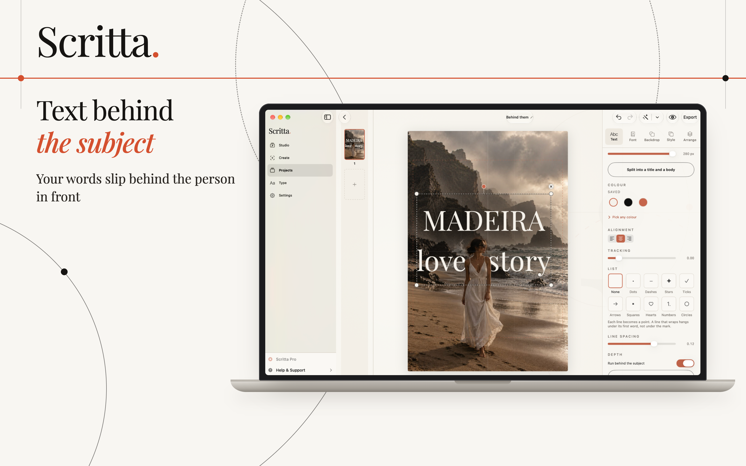
The effect works because it breaks a rule the eye expects. Text on a photo normally sits on top of everything. When part of a word disappears behind a person, the brain reads the word as being inside the scene, at a certain distance, and the flat picture gains a sense of depth.
Three layers
Every version of the effect is built the same way, from back to front:
- The background - the original photo.
- The text - placed over the background.
- The subject - a cut-out of the person or object, placed back on top of the text.
The hard part has always been the third layer. Cutting a person out cleanly by hand, especially around hair, takes time. Since iOS 16, iPhones and iPads can lift a subject from the background on their own, and apps can use the same kind of on-device subject detection to build the cut-out automatically.
Which photos suit it
The cut-out is only as good as the separation between the subject and what is behind them. Photos that work well:
- A clear subject against a simpler background - a person against sky, sea, a wall or a distant landscape.
- Space above or beside the head - the text needs room to sit behind the subject, not just next to them.
- Some depth - a subject in the foreground with the background further away. Portrait mode photos are often ideal.
Photos that tend to fail:
- Subjects that blend into the background in colour or brightness.
- Very fine, flyaway hair against a busy background.
- Groups where people overlap, so it is unclear who should be in front.
- Crops where the subject fills the entire frame and there is nowhere for the text to go.
Choosing the word and the font
One word, or two short ones. A place name, a month, a single idea. The effect needs large letters, and large letters mean few of them.
Heavy letters. Bold serifs and thick sans serifs hold up best, because part of each letter will be hidden and the rest has to carry the shape. A thin or script font, partly covered, often becomes unreadable.
Cover a little, not a lot. The subject should overlap part of one or two letters. Cover too much and the word cannot be read; cover nothing and there is no effect at all.
Colour from the photo. White and cream look classic. A colour taken from the scene, such as the sea or a warm stone wall, makes the word feel like it belongs in the picture.
The mistakes that give it away
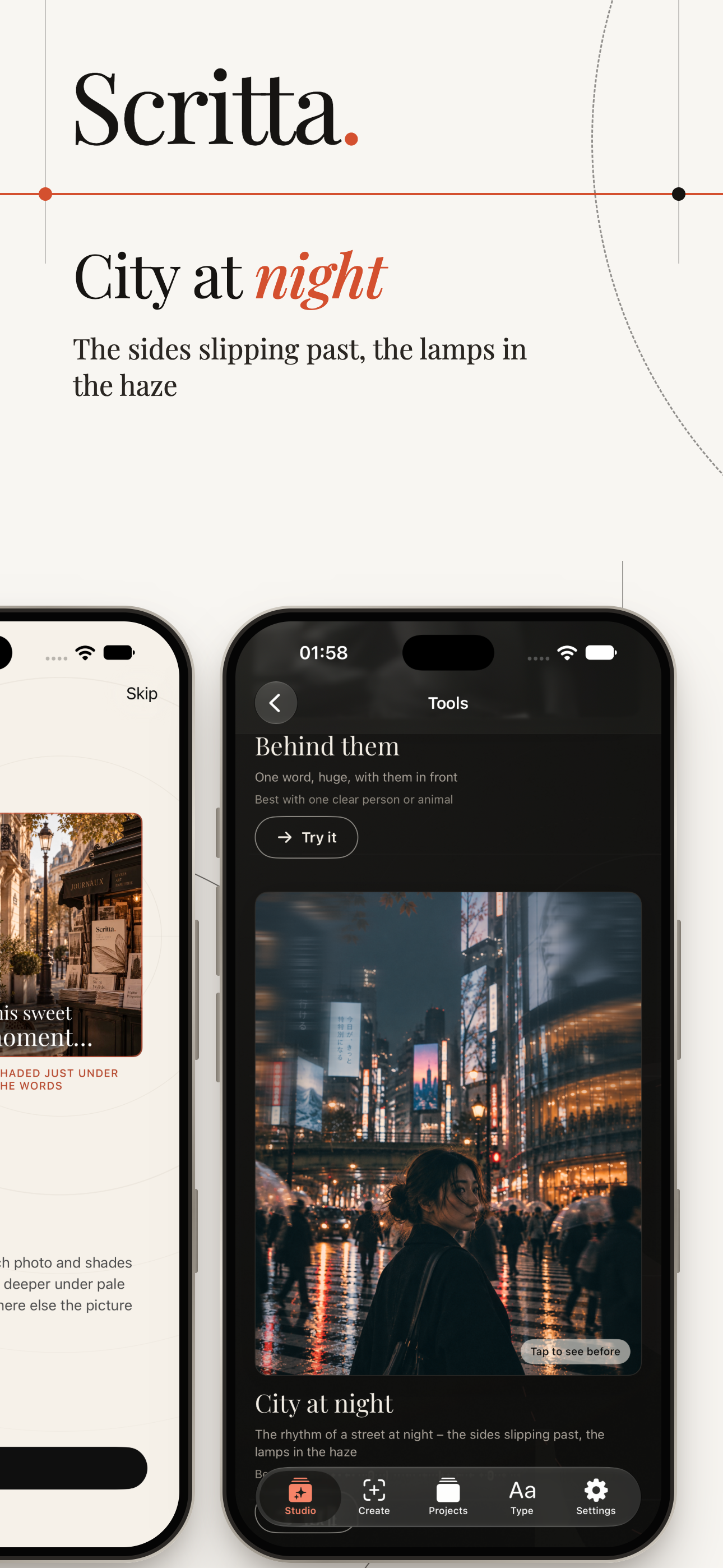
- A halo around the subject. A thin line of the old background left around the cut-out. Most visible on hair and against dark text.
- Missing pieces. A hand or the edge of a dress that the detection missed, so the text cuts across it. Check hands, bags and anything the person is holding.
- Text that should be behind something else too. If the word passes behind the person but in front of a tree that is clearly nearer the camera, the depth feels wrong.
- Using it on every slide. The effect is striking once. On every slide of a carousel it becomes a gimmick. Save it for the cover slide or one moment in the story.
Beyond one word
Once the subject is separated from the background, other ideas become possible. You can place the same person on a different slide, keep the background and change who stands in it, or fill letters with the photograph and let the picture open up behind them. The same rules apply: a clear subject, a simple background, and one idea per slide.