People look at a story for a second or two before they tap on. In that time the words have to be read without effort, and the photo has to still look like the photo you chose. The two goals pull against each other, and the usual fixes give up one to save the other.
Start with where, not how
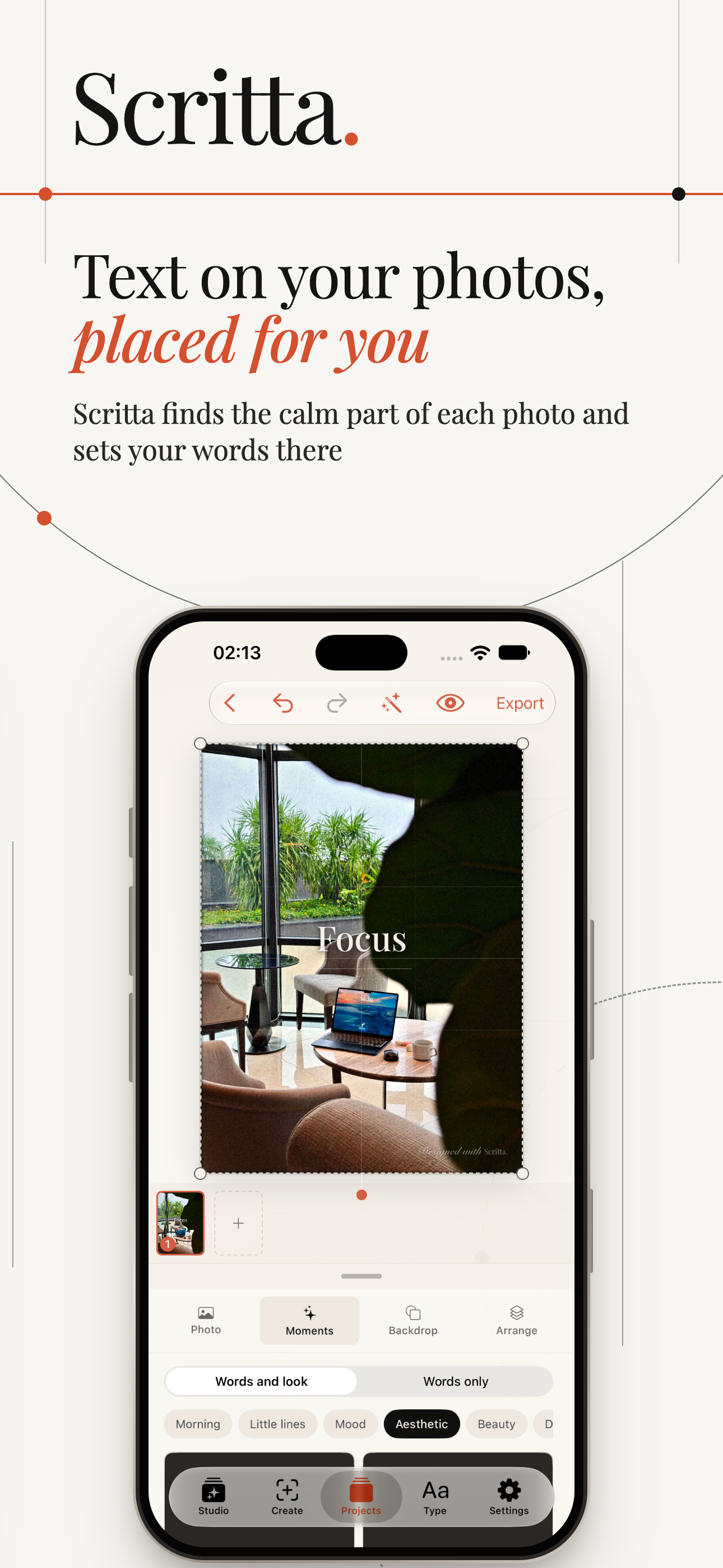
Before you think about colour or shadows, find the calm part of the picture. Almost every photo has one: an area with little detail and a fairly even tone. Open sky. A plain wall. Sand, water, a tablecloth, the blurred background behind a portrait.
Text on a calm area needs almost no help. Text on a busy area - leaves, a crowd, a street full of signs - fights with every edge underneath it, and no amount of adjustment makes it fully comfortable to read.
A few placement rules that hold up well:
- Keep off faces. Viewers look at faces first. Words across a face are both harder to read and irritating, because they cover the thing people came to see.
- Keep off the main subject in general. If the photo is of a building, the words go in the sky above it, not across its front.
- Use negative space deliberately. If you are taking the photo with text in mind, leave room for it. Framing the subject slightly off-centre gives the words a place to live.
- Mind the edges on stories. On a 9:16 story, the top and bottom of the screen are covered by the profile name, progress bar and reply field. A common rule of thumb is to keep text out of roughly the top and bottom 250 pixels of a 1920-pixel frame.
How much contrast is enough
The web accessibility guidelines (WCAG) give a useful reference point. They ask for a contrast ratio of at least 4.5 to 1 between normal text and its background, and 3 to 1 for large text. Those numbers were written for text on flat colour, not photographs, but they are a good sense of scale: text needs to be clearly lighter or clearly darker than whatever sits directly behind it.
The difficulty with photos is the word "directly". A photo does not have one background colour. A white word over a sky may pass easily at one end and vanish into a cloud at the other. When you check readability, look at the worst letter, not the average.
The fixes people reach for, and what they cost
Darkening the whole photo. A dark overlay across the entire frame makes white text readable anywhere. It also makes the photo look like it was taken on a grey day. On a single slide this can be acceptable; across a carousel it flattens every picture into the same murky mood.
A solid box behind the text. Very readable, and occasionally the right look for a bold, graphic style. But a rectangle is the most artificial shape you can put on a photograph, and it reads as a label stuck on rather than part of the image.
A drop shadow on the letters. A soft, slightly offset shadow helps on mid-tones. A hard black shadow looks dated quickly, and neither type helps much when the background under the letters is very busy.
An outline. Readable, rarely pretty. It works for bold display type and meme captions, less well for anything meant to feel calm.
A better fix: shade only where it is needed
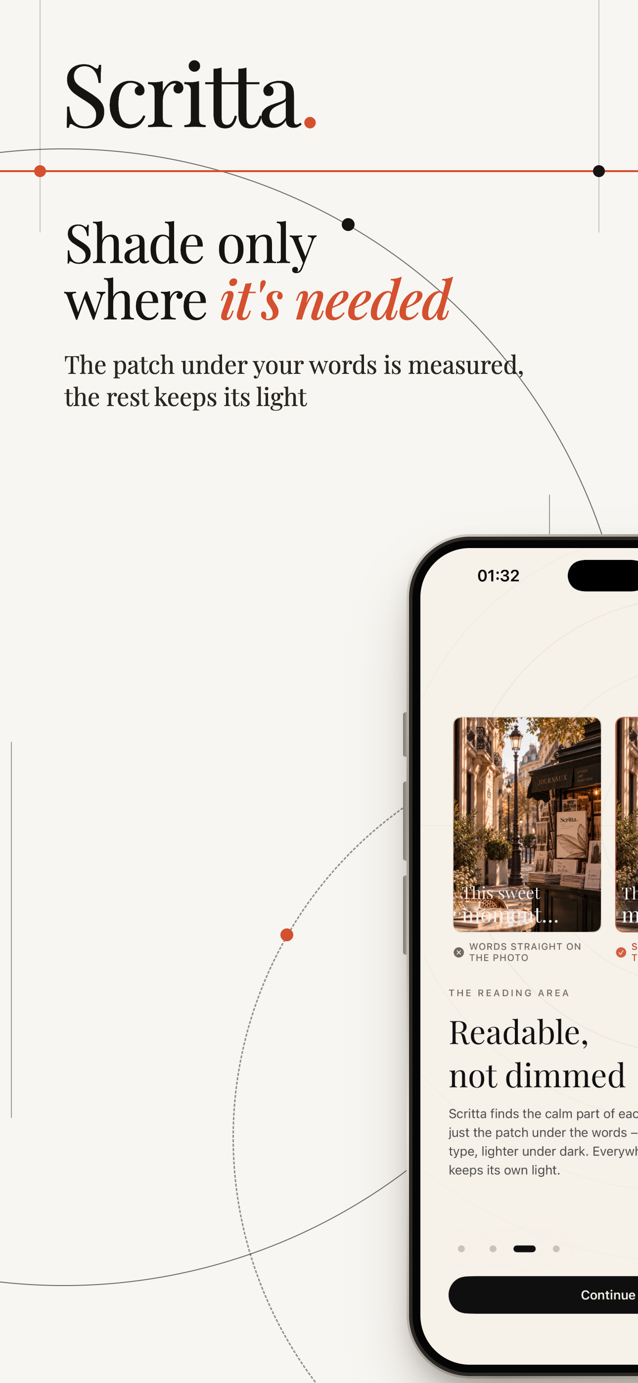
The approach that tends to look best is local: darken or lighten only the area right behind the words, with soft edges, and leave the rest of the photo alone. Done well, it is barely noticeable as a separate element. The picture looks as though the light simply falls a little differently where the words are.
Two details make it work:
- Take the tone from the photo. A neutral black shade on a warm sunset looks grey and dirty. A deep warm brown, taken from the photo itself, looks like part of it.
- Size it to the text. The patch should be just larger than the words. When it spreads across half the frame it stops being a local fix and turns back into an overlay.
Type choices that help readability
- Weight beats size. A slightly heavier font is often more readable over a photo than a much bigger thin one. Hairline serifs are lovely on paper and difficult on a changing background.
- Short lines. Five or six words per line is plenty for a story. Longer lines cross more of the image and are more likely to pass over a busy patch.
- Less text per slide. If the words need a second read, split them across two slides rather than shrinking them.
- One colour. White or near-white on dark areas, near-black on light ones. A coloured word can work as an accent, but it should not carry the meaning.
A quick check before you post
- Look at the slide at arm's length on your phone, at the brightness you normally use.
- Find the letter with the worst background behind it. Can you read it without effort?
- Squint. If the words disappear into the photo when you squint, they need more contrast.
- Check that no text sits under the top or bottom interface area of a story.
- Flip to the next slide. Does the text sit in a similar place, or does it jump around?
The last point matters more than it seems. On a single photo, readable text is enough. On a carousel, text that lands in a consistent spot from slide to slide is what makes a set of photos feel like one story.