A carousel is a small sequence, closer to a short film than a single picture. People read it the way they read a page: from left to right, expecting some things to change and others to stay the same. The trick is choosing which is which.
What should change is the content - a new place, a new moment, the next line of the story. What should stay the same is everything that frames it.
1. Match the light first
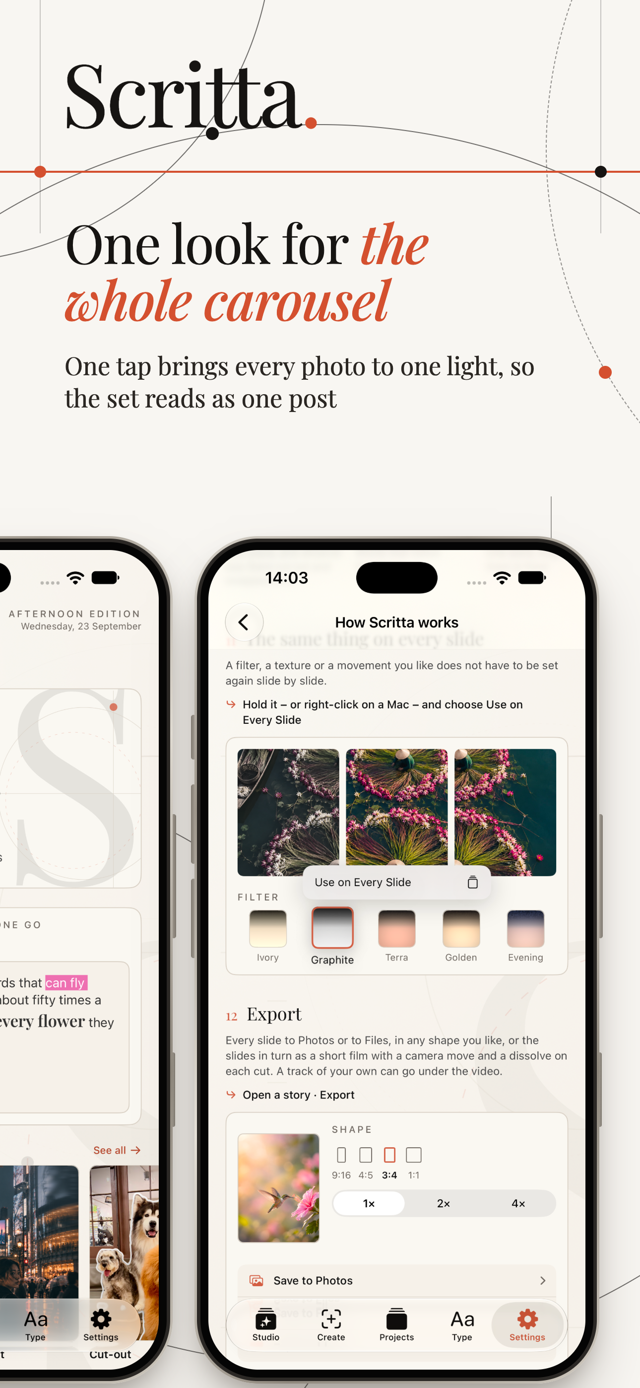
Photos taken on different days, or even at different times of the same day, carry different light. One is warm and golden, the next cool and blue, the next flat and grey. Placed side by side, they look like they come from three different trips.
The fix is to apply the same edit to all of them, then correct the outliers:
- Choose one photo as the reference - usually the strongest one, often the first slide.
- Apply the same filter or preset to every photo.
- Adjust white balance on any photo that still looks off. Warmth is the single biggest giveaway.
- Bring exposure roughly into line, so no slide is much brighter or darker than its neighbours.
You are not trying to make the photos identical. You are trying to make them look like they were taken by the same camera in the same mood.
2. One shape for every slide
Instagram shows every slide in a carousel at the shape of the first one. Mixed orientations get cropped or padded, and the crop is rarely where you would have chosen. Crop all photos to one ratio before posting - 4:5 is a safe default for feed carousels.
3. Keep text in the same place
Nothing breaks a carousel faster than text that jumps. A title near the top on one slide, the middle on the next and the bottom corner on the third makes the eye search for it every time.
- Pick a zone for the text - top third, bottom third, or a consistent side.
- Keep the first line at the same height on every slide, even when the amount of text changes.
- If one photo has no calm area in that zone, move the photo inside the frame rather than moving the text.
There are exceptions. A title slide can be different on purpose, and so can a final slide with a call to action. But the slides in between should follow one rule.
4. Same fonts, same sizes
Choose one pair - a title font and a text font - and use it on every slide. Keep the sizes consistent too: the same title size, the same text size. A carousel where the text shrinks on the slides with more words looks improvised.
If a slide has too much text for the size you chose, split it across two slides.
5. A small palette
Two or three colours for text and accents are enough. The easiest way to pick them is from the photos themselves: a deep tone from a shadow, a light one from the sky or a wall, one accent from something distinctive in the scene. Colours taken from the photos always look like they belong.
6. Give it a rhythm
Consistency does not mean monotony. Within the rules above, vary the rhythm:
- Alternate wide shots and close details.
- Follow a busy photo with a calm one.
- Let one slide carry a single large word and the next a full sentence.
The frame stays the same, and the content moves inside it. That is what makes people keep swiping.
7. Save the style, not just the post
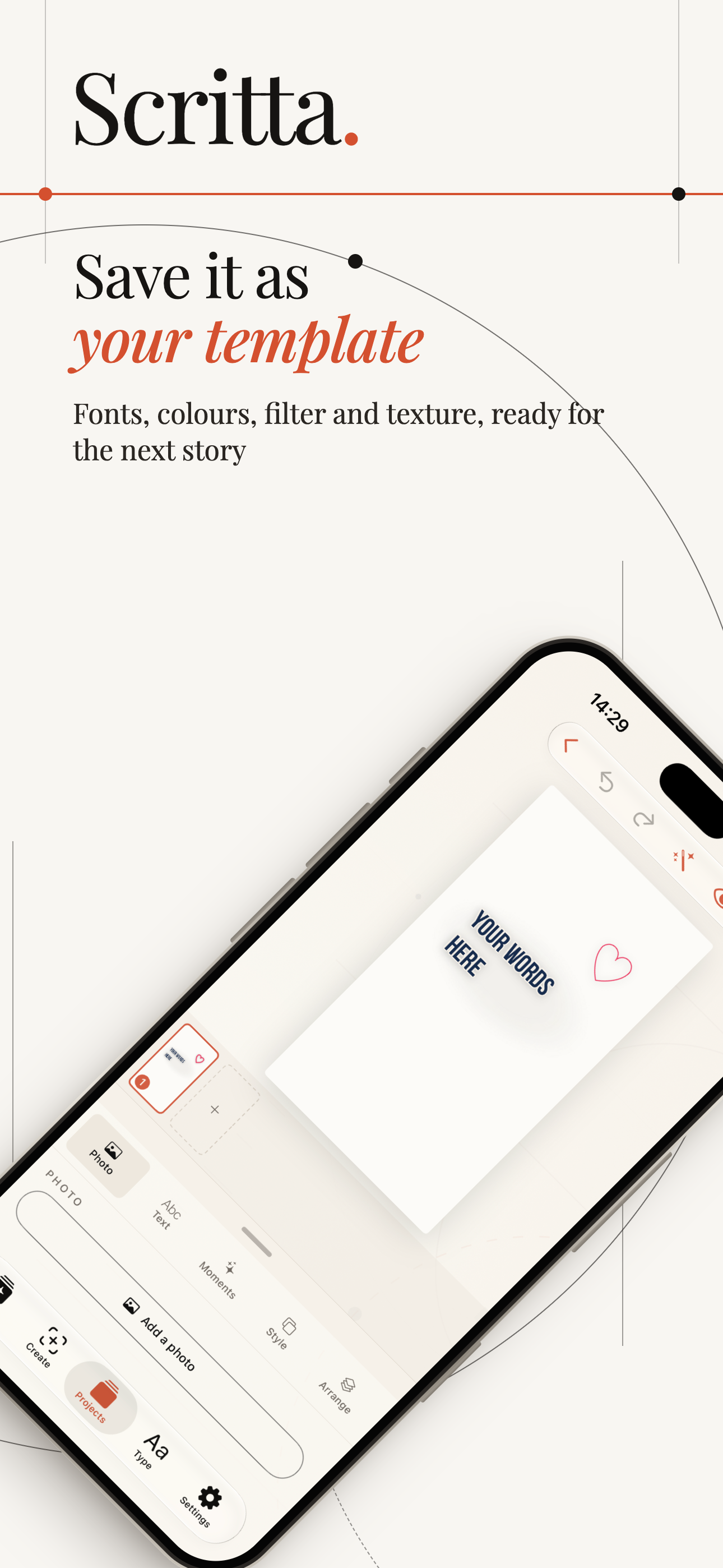
The most consistent profiles are not made of consistent carousels; they are made of carousels that share the same style week after week. Once you find a combination of fonts, colours, filter and texture that feels like yours, save it and start the next carousel from it, instead of rebuilding the look from memory.
A quick check
- Swipe through quickly. Does any slide jump out as a different temperature or brightness?
- Does the text land in the same place each time?
- Is every slide the same shape?
- Are you using more than two fonts?
- Would you recognise this as your post without seeing the name?