Font pairing sounds like a designer's topic, but the problem is familiar to anyone who has made a carousel. You find a beautiful script for the title, then have to choose something for the sentence underneath, and nothing looks right next to it.
Why two fonts
Each font on a slide is a voice. One voice is clear but flat. Two voices give you a contrast between the headline and the text, which helps people see at a glance what to read first. Three or more start to compete, and the slide loses a sense of who is speaking.
Two fonts also make consistency across a carousel manageable. You have one decision for titles and one for everything else, and you can repeat them on every slide.
Give each font a job
The title font carries the mood. It is used for a few words, large, so it can be expressive: a high-contrast serif, a condensed display face, a handwritten script. Readability at small sizes matters less because it will never be small.
The text font carries the meaning. It is used for full sentences, at smaller sizes, over a photograph. It should be plain, even and easy to read - usually a clean sans serif or a sturdy serif with no delicate strokes.
Most failed pairs come from asking one font to do both jobs, or from choosing two fonts that both want to be the title.
Contrast, not similarity
The classic mistake is pairing two fonts that are nearly the same: two geometric sans serifs, or two similar serifs. They are different enough to look like an error and similar enough not to create any contrast. Designers sometimes call this conflict.
Good pairs differ clearly in one or two ways and agree in the rest:
- Serif with sans serif. The most reliable contrast there is. An elegant serif title over a simple sans text is the backbone of most editorial layouts.
- Weight. A heavy title over a light or regular text.
- Width. A tall, condensed title over a normal-width text.
- Style. A script or handwritten title over a very neutral text - as long as the script is kept to a few words.
At the same time, fonts that share a similar x-height (the height of the lowercase letters) or similar proportions tend to sit comfortably together, even when their styles are different.
Pairs that are hard to get wrong
A few long-standing combinations, all freely available:
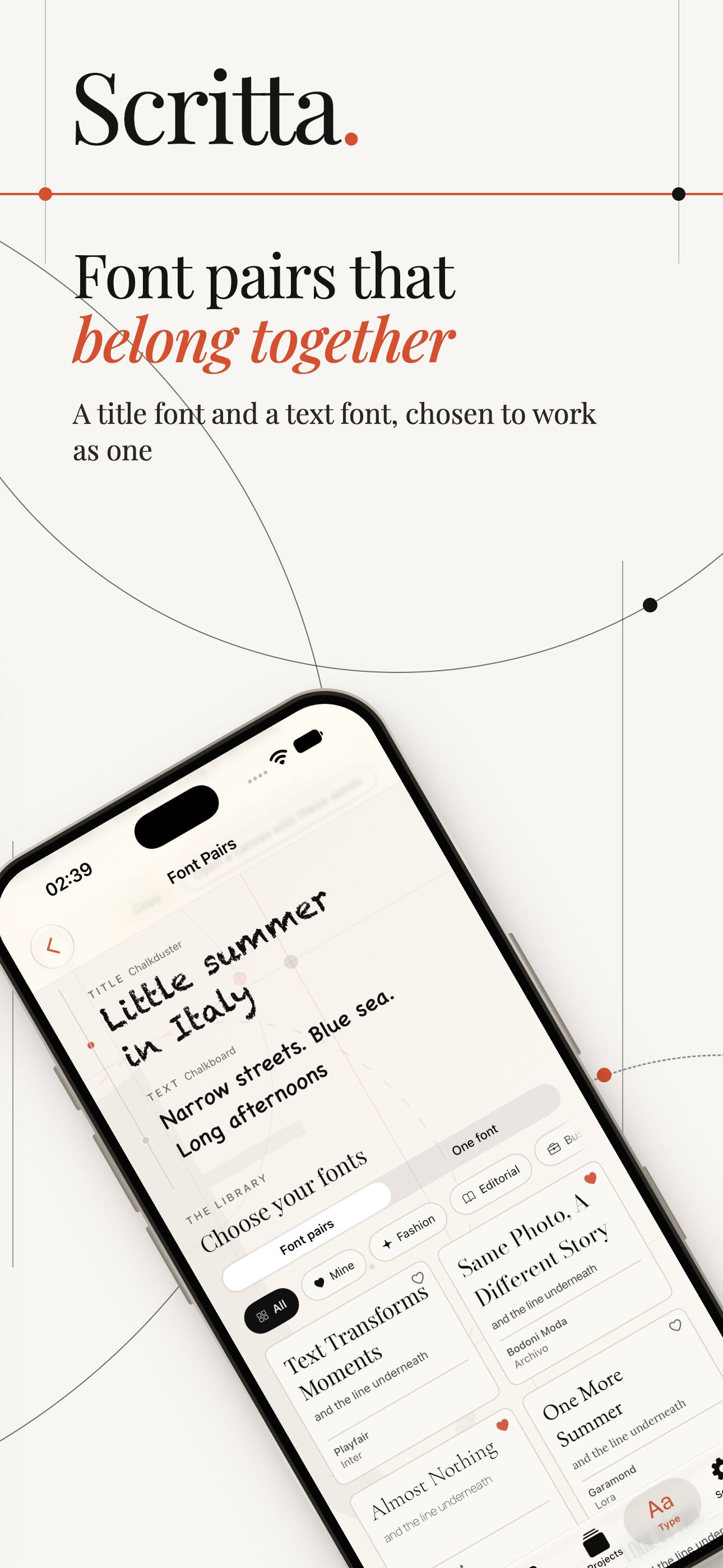
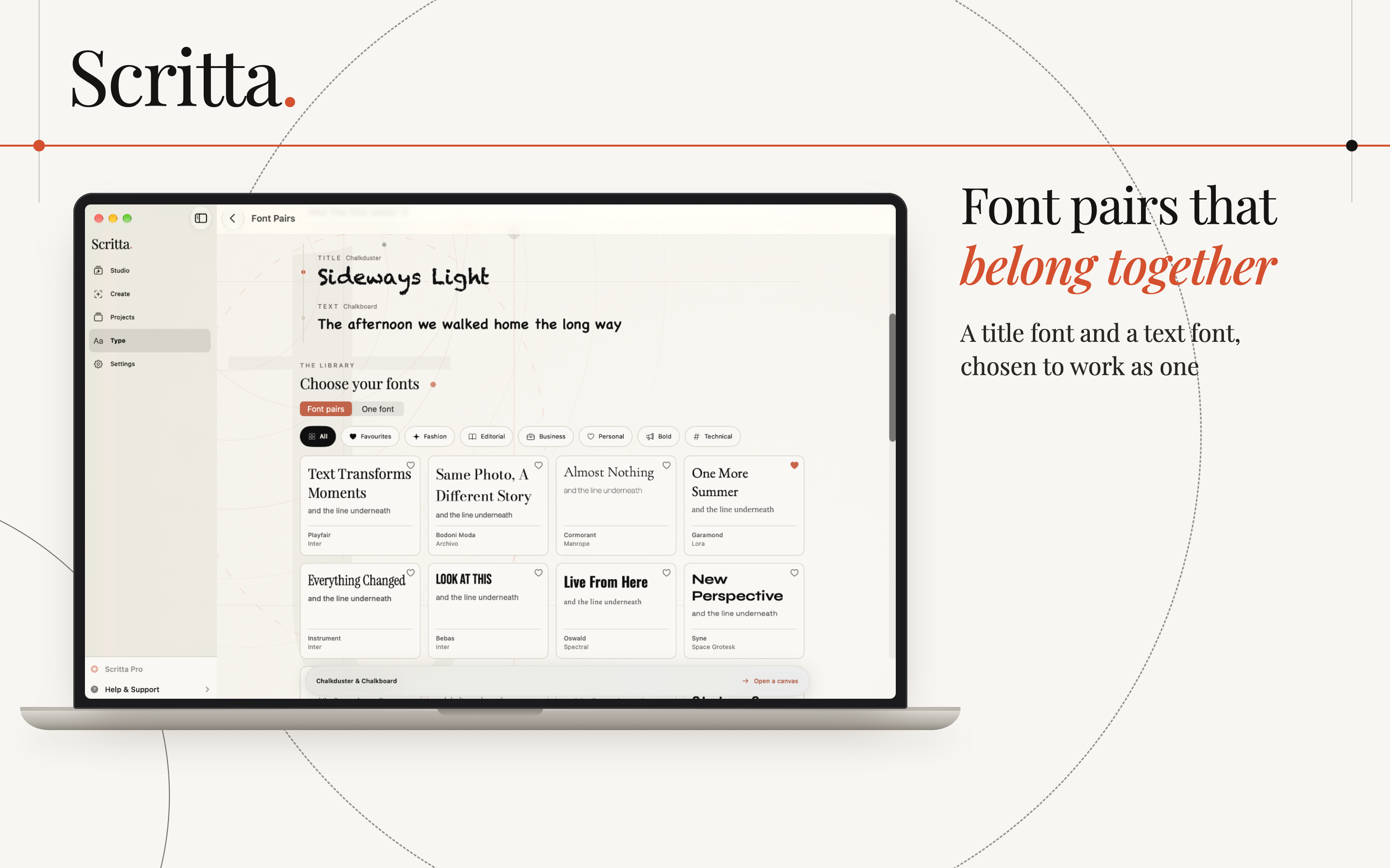
- Playfair Display and Inter - a high-contrast, fashion-magazine serif with a neutral modern sans.
- Lora and Source Sans - a softer, bookish serif with a calm humanist sans.
- Montserrat and Merriweather - a bold geometric title with a sturdy serif made for reading on screens.
- A superfamily - a font family that comes in both serif and sans versions designed together, such as Merriweather and Merriweather Sans. The contrast is built in and the proportions already match.
Matching the pair to the mood
The pair tells people what kind of story this is before they read a word.
- Editorial and travel: an elegant serif, often in italic for a single word, over a quiet sans.
- Fashion: very high-contrast serifs, wide tracking in capitals, lots of empty space.
- Personal and warm: a handwritten or rounded title over a friendly sans.
- Business and product: a strong sans title with a matching sans or a sturdy serif text. Scripts rarely belong here.
- Technical: a monospaced or squared-off title with a very neutral text font.
Small rules that make pairs look finished
- Keep a clear size difference. If the title is only slightly bigger than the text, the contrast gets muddy. Make it at least half again as large, often twice.
- Use italics as an accent. One word in italic in the title is often more elegant than a third font.
- Do not stretch or squash. Distorted letters are the fastest way to make a slide look amateur.
- Test on the actual photo. A pair that looks great on a white page can fall apart over a busy background. Delicate strokes are the first to disappear.
- Repeat the pair on every slide. The effect comes from consistency. Changing the pair halfway through a carousel breaks it.
A note on licences
If you bring in your own fonts, check the licence before using them on posts for a business. Many fonts are free for personal use but need a commercial licence for anything that promotes a brand or product. Fonts published under the SIL Open Font License, which covers most of Google Fonts, can be used commercially.