The paper version worked. A cork board in the kitchen, a whiteboard by the door, notes on the fridge - these persisted for decades because they had one property no app has managed to replicate: you saw them without deciding to.
That is the whole design problem. A household display succeeds or fails on whether it is passively visible, and everything else is detail.
Placement decides everything
Put it where people already stand still. The kitchen while the kettle boils, the hallway while shoes go on, the wall opposite the dining table.
Not the living room television, which is off most of the time and in use the rest. Not a screen in a study nobody enters. If the display requires a detour to look at, it is an app with a bigger screen.
The test: could someone read it without changing what they were already doing? If yes, it will be read several times a day without anybody trying.
What earns its place
Ruthlessness here matters more than features. A board with fifteen things on it is a board nobody reads.
Today and tomorrow only. Not the month. The question people have when they glance at a wall is what is happening now and next, and a month view answers a question nobody is asking.
Who is where. Late home, staying over, away until Thursday. This is the single highest-value item and the one most calendars bury.
The three or four things that need doing. Not a task backlog. The things that must happen today.
One countdown. The holiday, the birthday, the exam. Children in particular orient around this, and it answers a question that otherwise gets asked daily.
What to leave off
- Long task lists. Beyond about six items the eye stops reading and starts skipping.
- Anything private. A household display is visible to guests, plumbers and anyone at the window. Medical appointments and money belong somewhere else.
- Live feeds. News tickers and social media turn a board into a distraction and defeat the passive-glance purpose entirely.
- Detailed weather. A single icon is useful. An hourly chart is something people stop and read, which is exactly the behaviour you do not want from a wall.
Why the shared calendar alone fails
Shared calendars are genuinely good and they solve a different problem. They are for entering and checking things deliberately - which means opening a phone, and opening a phone is a decision.
Households run on ambient information: the sense of what is happening this week that everyone absorbs without being told. That comes from repeated passive exposure, and a phone cannot provide it. The calendar and the board are complementary, and expecting one to do the other's job is why both get abandoned.
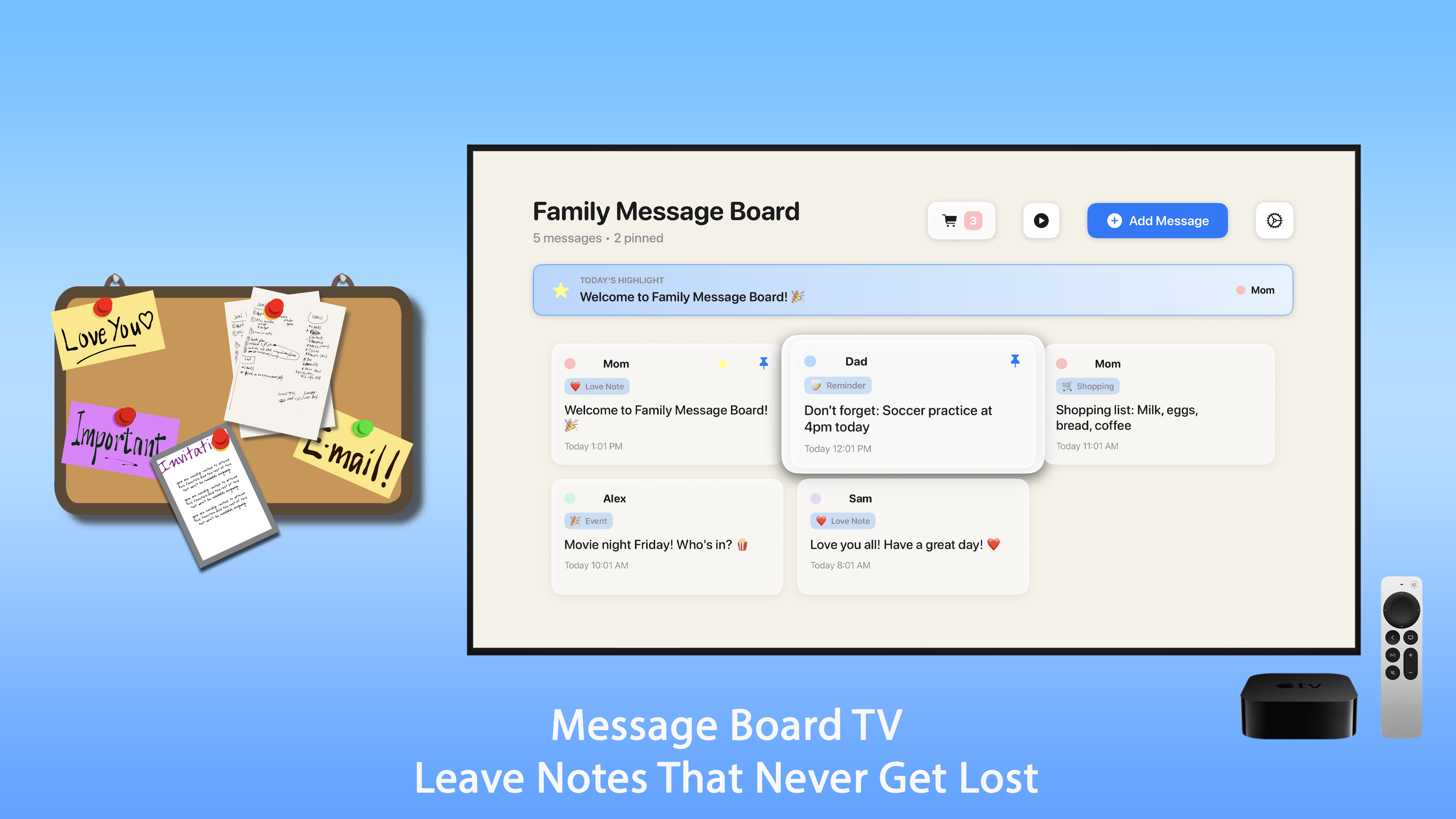
Family Board runs this on an Apple TV - notes, tasks and what is on today, displayed rather than filed.
Getting it adopted
Household systems fail socially rather than technically. Three things help.
Everyone can write to it. A board only one person updates becomes that person's board, and everyone else stops treating it as authoritative within about a fortnight.
Start with less than you think. Today's events and three tasks. Add things only when someone asks for them. A board that begins comprehensive gets ignored before it earns trust.
Let it be wrong occasionally. A display that is out of date is still better than a paper note nobody wrote. Households that insist on accuracy end up maintaining a system rather than using one.
The practical bits
- Dim it in the evening. A bright screen in a kitchen at 10pm is unpleasant. Anything that adapts to ambient light is worth having.
- Decide what happens when it is off. A black rectangle on the wall is worse than no display. Something ambient - a clock, artwork, a photo - keeps it from being dead space.
- Use an old device. This does not need current hardware. An older Apple TV or a spare tablet does the job entirely.
The measure of whether it is working is not whether it is being updated. It is whether someone has stopped asking what time the thing is on Saturday - which, when it happens, is oddly satisfying.