Samsung built an entire product line around this idea, with a matte panel and a physical frame. You can get most of the effect on an ordinary television, and the parts that matter are settings rather than hardware.
Brightness, which is the whole thing
Televisions ship configured to look good in a shop, which means bright enough to compete with fluorescent lighting. A painting displayed at that brightness looks backlit, because it is.
Real artwork reflects light. A screen emits it. The closer you get the screen's output to the ambient light of the room, the more the brain reads it as an object on the wall rather than a display.
Turn the brightness down further than feels right. Then turn it down again. In a normally lit living room the setting that looks correct for art is often around a quarter of what you would use for a film, and if it looks slightly dim when you first set it, you are probably close.
Colour temperature
Most sets default to a cool white, which reads as clinical next to warm domestic lighting and instantly identifies the object as electronic.
Switch to the warmest available preset. On many televisions this is called Warm2 or Movie, and it is what makes a screen sit alongside lamps rather than fighting them.
The test is simple: stand at the far end of the room, glance at it, and see whether your eye reads it as a picture or a screen. Colour temperature decides that more than resolution ever will.
Motion smoothing off, always
Irrelevant for a still image, and it matters at the transitions - interpolation makes crossfades between works look like video processing rather than a change of picture.
Turn off every motion setting the set offers. Also turn off dynamic contrast and any "vivid" enhancement, both of which alter the artwork - which for a painting is the one thing you do not want.
Pacing: much slower than the default
The most common mistake in every digital frame ever configured.
A picture changing every thirty seconds is a slideshow, and a slideshow demands attention. A picture changing every ten or fifteen minutes is a painting that occasionally becomes a different painting, and that is a completely different object in a room.
Long dwell times also mean people actually look at the work. Something on the wall for a quarter of an hour gets noticed properly during that time; something on for thirty seconds is background motion.
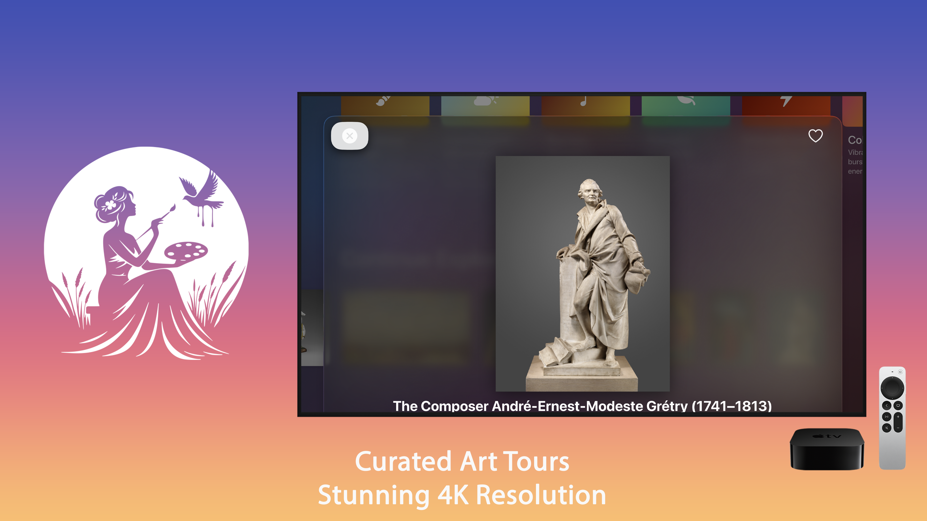
Crossfades should be slow - several seconds - so a change registers peripherally as a shift in light rather than as an event.
Framing and aspect ratio
Most paintings are not 16:9. A landscape-format television showing a portrait-format work will either letterbox it with black bars or crop it, and both look wrong.
Black bars are the lesser problem, and on an OLED they genuinely disappear in a dim room. Cropping a painting to fill a widescreen panel is worse - it is the one choice that makes the display look careless rather than merely electronic.
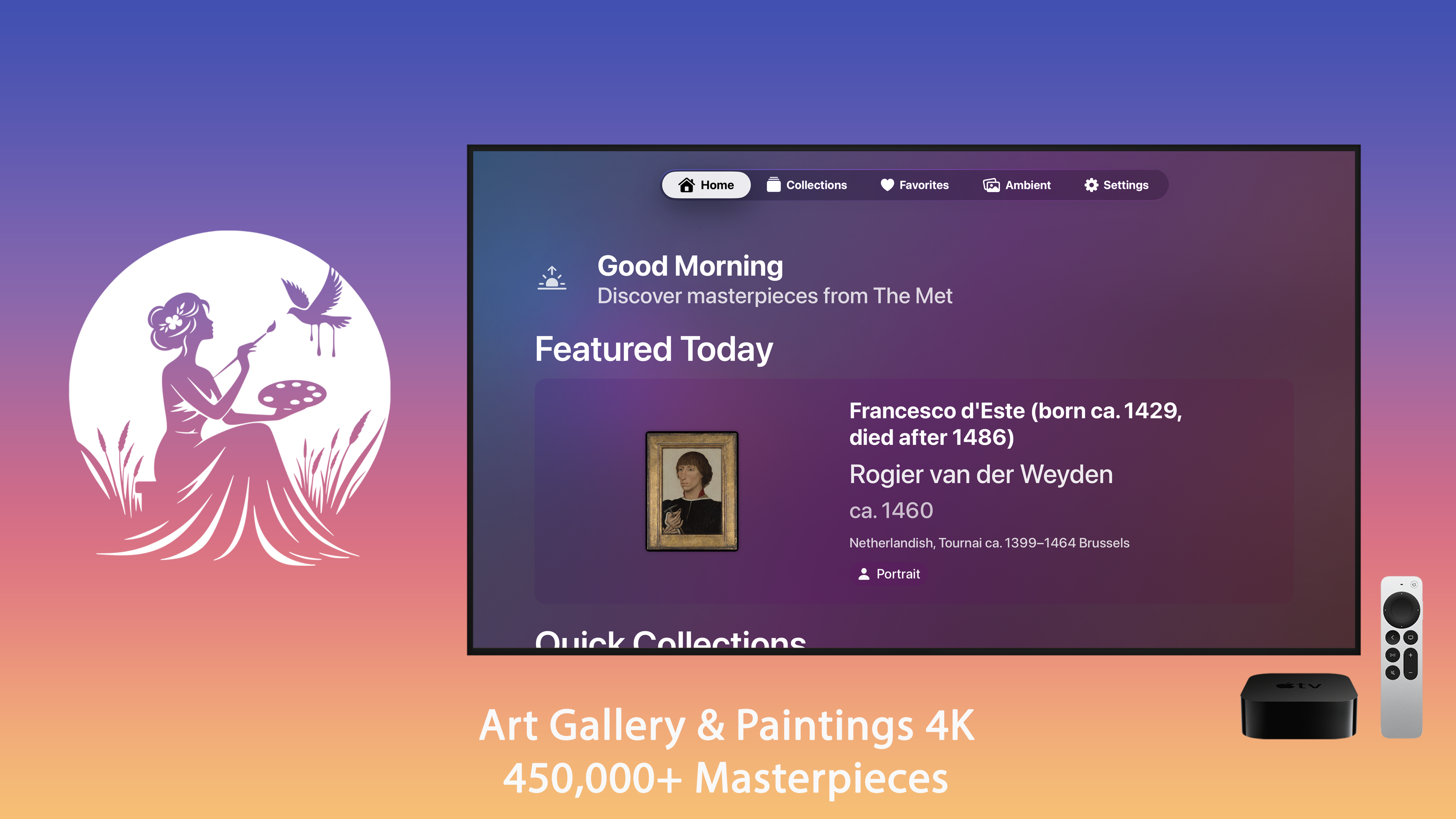
A well-made art app handles this by choosing works that suit the panel, or by placing the work on a neutral surround rather than stretching it. Art Gallery is what we made for Apple TV, in 4K with long dwell times by default.
Hiding that it is a television
Three physical things that matter more than any setting.
The interface must never appear. A clock, a progress bar, a "now playing" overlay - any of them and the illusion is finished. Whatever you run has to go full screen with no chrome.
Hide the cables. The single most effective physical change. A screen on a wall with a cable hanging from it reads as equipment; the same screen with nothing visible reads as a frame.
Consider an actual frame. A wooden surround around an ordinary television costs very little and does most of the work that Samsung charges a premium for.
The energy question
Worth being honest about. A 55-inch television at low brightness draws roughly 50 to 70 watts. Running it eight hours a day is a real amount of electricity, and considerably more than a printed picture.
Two mitigations: use the set's own timer or ambient light sensor so it stops when the room is empty, and treat it as something you switch on when people are in the room rather than something that runs continuously. The effect is worth having in the evening; it is not worth having at 3am to an empty house.
The five-minute setup
- Brightness to about a quarter of your film setting.
- Colour temperature to the warmest preset.
- All motion and enhancement processing off.
- Dwell time to ten minutes or more, with slow crossfades.
- Nothing on screen but the artwork.
The general case - what else is worth putting on a screen nobody is watching - we covered in beyond the Apple TV aerials. Art is the version that asks the most of the settings, because it is the one pretending to be something other than a screen.