Attention restoration theory distinguishes between two kinds of attention. Directed attention is the effortful kind - reading, deciding, resisting distraction - and it depletes. Soft fascination is what happens when something holds the eye without demanding anything: clouds, waves, a fire, rain on a window.
The claim is that soft fascination lets directed attention recover, in a way that staring at a wall does not and scrolling certainly does not. The evidence base is reasonable and it explains something people notice without being able to articulate.
What makes motion soft rather than demanding
Three properties, and content either has them or it does not.
No events. Nothing starts or finishes. The moment there is a beginning or an ending, the brain begins tracking a narrative, and tracking is effortful.
Continuous, unpredictable-but-bounded motion. Perfectly regular movement becomes invisible within minutes. Chaotic movement is agitating. What works sits between - varied within a stable structure, which is exactly what flames, water and kaleidoscopic patterns do.
Stable brightness and no cuts. A hard cut reads as an event from the corner of the eye even when you are not looking.
Abstract versus natural
Most writing on this assumes nature footage. Nature works, and abstract pattern has one specific advantage over it: no semantic content.
A forest scene contains recognisable objects, and the brain identifies them whether asked to or not. A geometric pattern contains nothing to identify, so it occupies the visual system without engaging the part that names things. For concentration specifically, several people find that difference matters.
It also avoids a failure mode of nature footage - a bird crossing frame, a wave breaking loudly - which are events, and events pull attention.
Colour is the setting that matters
More than the pattern itself.
- Cool, desaturated palettes - blues, greens, muted violets - settle a room. This is the right choice for evening, for background during work, and for anywhere someone is trying to relax.
- Warm, saturated palettes - oranges, reds, high-contrast combinations - stimulate. Good for a party, wrong for a study.
- High contrast between adjacent colours reads as busier regardless of what the colours are.
The practical version: if something feels agitating rather than calming, change the palette before changing the content. It is usually saturation rather than motion.
Speed
Slower than instinct suggests. The rate at which a pattern evolves should be barely perceptible - if you can watch a full cycle of change while looking at it deliberately, it is too fast for background use.
Anything synchronised to music is a different category entirely. Audio-reactive visuals are engaging, which is the opposite of the goal here.
Where this is genuinely useful
A second screen while working. Not in your field of view while reading - to the side, so it is peripheral. The eye rests there between passages instead of finding a phone.
Winding down in the evening. Something to look at that is not a feed. The absence of content is the point.
Rooms where a blank television looks wrong. A dark rectangle is a dead object; slow abstract motion is closer to lighting.
Sensory regulation. Predictable, non-demanding visual motion is used deliberately by a lot of people, and it is a real application rather than a decorative one.
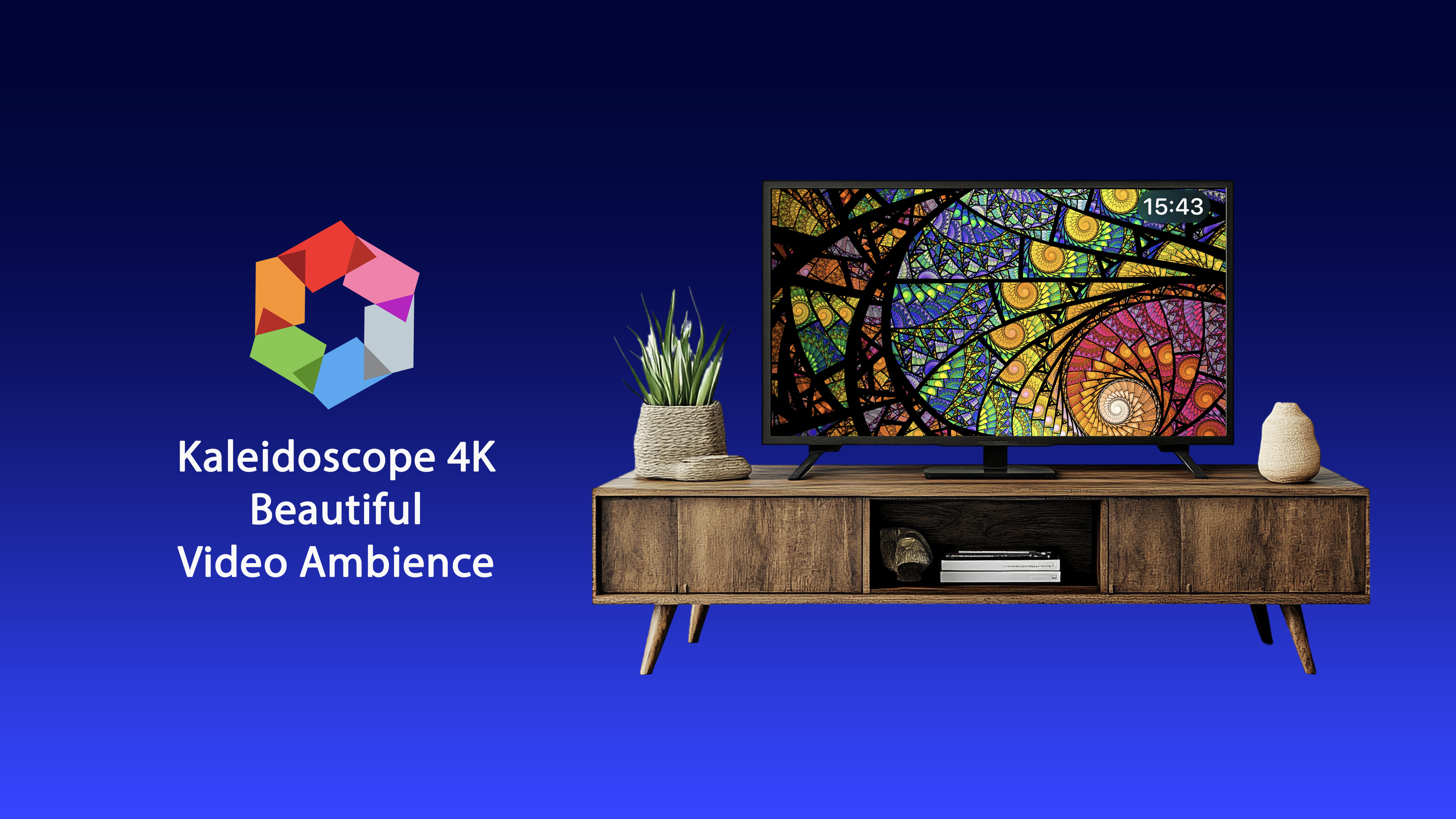
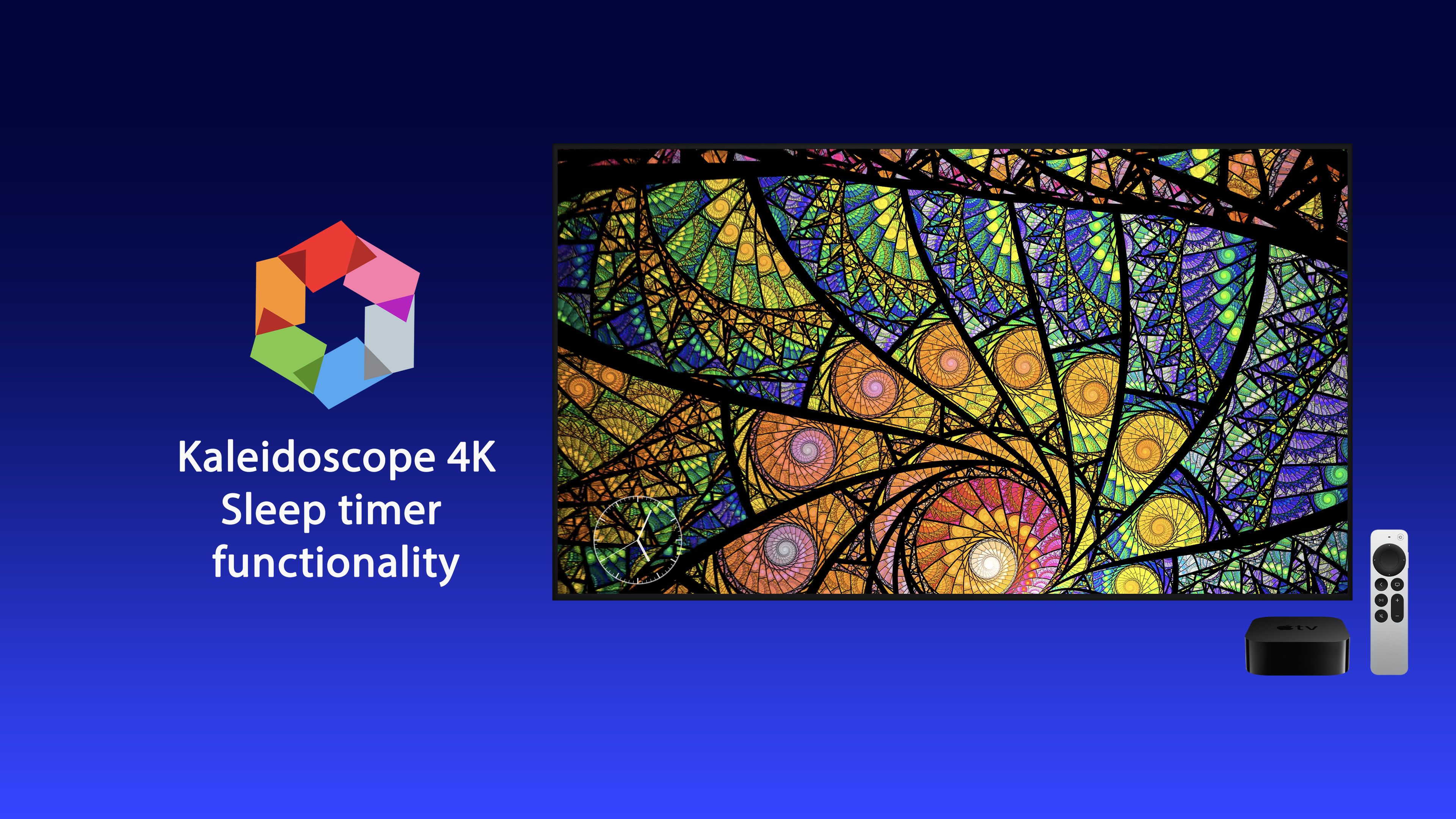
Kaleidoscope 4K is what we made for this, with palette and speed as the controls that actually matter.
Where it does not help
Two honest limits.
It does not help with tasks that are themselves visual. Editing photographs or designing anything means the visual system is already occupied, and adding motion competes rather than rests.
And it is not a substitute for a break. Soft fascination supports recovery; it does not replace standing up and looking at something twenty metres away, which remains the single most effective thing for tired eyes.
The general question of what to put on a screen nobody is watching we covered in beyond the Apple TV aerials.