Screens are forgiving. A 2000-pixel image fills a laptop display at a size where every pixel is doing several pixels' worth of work. Print is not forgiving, because paper holds far more detail per centimetre than a screen does.
The arithmetic
Print quality is measured in dots per inch. The useful thresholds:
- 300 dpi - the standard for photographic printing. Detail is beyond what the eye resolves at reading distance.
- 200 dpi - good. Most people cannot tell the difference from 300 on anything larger than A4.
- 150 dpi - acceptable for something viewed from a metre away.
- 72 dpi - a screen. Printed, it is visibly soft.
To find the largest good print from a file, divide its pixel dimensions by 300:
4032 × 3024 pixels (12 MP iPhone photo)
4032 / 300 = 13.4 inches
3024 / 300 = 10.1 inches
→ about A4 at full quality, A3 at 200 dpi
That is the whole calculation, and it settles most questions before any software is involved.
Viewing distance changes the answer
The reason billboards work at 20 dpi.
A print held at reading distance needs 300 dpi. A framed picture on a wall, viewed from two metres, is entirely convincing at 150. A large canvas across a room is fine at 100.
So the honest question is not "how big can I print this" but "how big, and where will it hang". A 12-megapixel photo makes a poor A2 print for an album and a perfectly good one for the far wall of a living room.
When upscaling helps
AI upscaling generates plausible detail rather than stretching existing pixels, and for print preparation it has a genuinely good use case: closing a modest gap.
Going from 200 to 300 dpi - roughly 1.5× - is exactly the job it is best at. The model has plenty to work from, invents little, and the result is a sharper print with nothing you would object to.
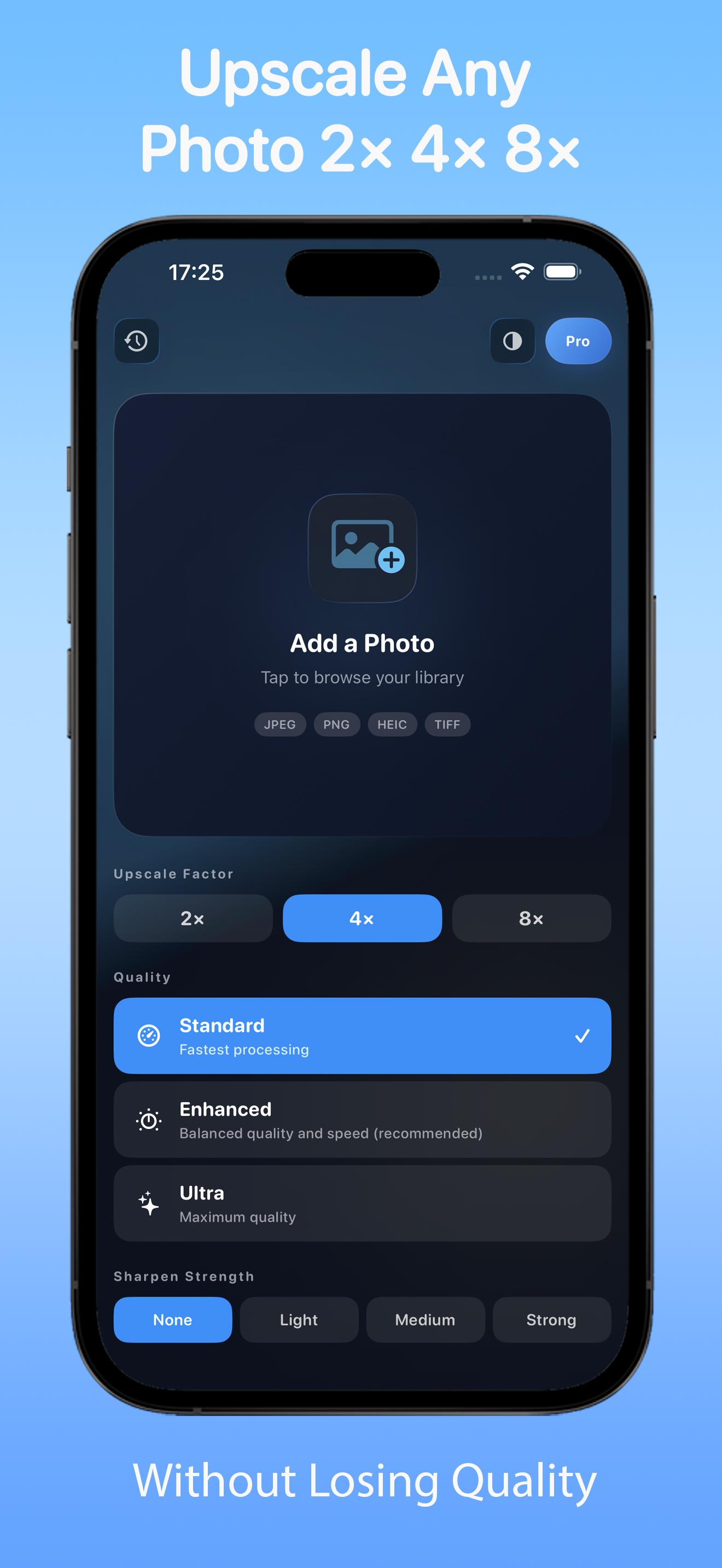
Where it stops working is large factors on weak sources. 4× on a phone screenshot produces confident, invented texture, and at print size that is visible. We went through the artefacts in detail in why AI-upscaled photos look plastic.
Practical rule for print: 2× at most, and check faces and fine texture at 100% before committing. SharpUpscale keeps the comparison alongside, which makes that check the easy option rather than the diligent one.
The two settings that ruin prints
Colour space. Phones and cameras often produce Display P3 or Adobe RGB. Most print services expect sRGB, and converting badly - or not at all - is why prints come back duller than the screen. Export a copy in sRGB for the printer and keep the wide-gamut original.
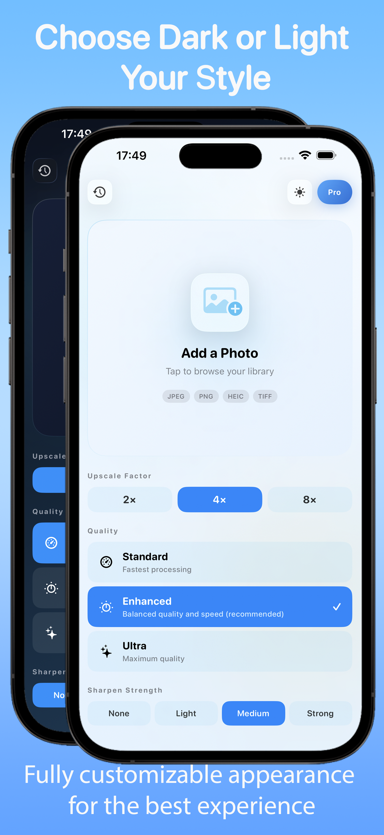
Brightness. Screens are backlit; paper is not. An image that looks correct on a bright display consistently prints darker, particularly in shadows. The standard correction is to brighten slightly before sending - and if you are printing regularly, to turn your display brightness down to something closer to paper white while editing.
Crop and aspect ratio
Phone photos are 4:3. Common print sizes are not: 6×4 is 3:2, A4 is roughly 1.41:1, square is square.
Either you crop deliberately or the lab crops for you, and the lab crops from the centre. Heads get taken off in family photos this way constantly. Crop to the exact ratio yourself, and do it before upscaling rather than after - the model composes to the frame it is given.
Before sending to print
- Divide pixel dimensions by 300 to find the comfortable size.
- Decide viewing distance; drop to 200 or 150 dpi if it hangs on a wall.
- Crop to the exact print ratio.
- Upscale only if you need it, no more than 2×, and check at 100%.
- Export sRGB.
- Brighten slightly, especially the shadows.
For old family photographs specifically the order changes - repair damage and denoise before upscaling, or the model builds detail around the scratches. We covered that workflow in upscaling old family photos.