Style transfer works by keeping the structure of your photograph and replacing its texture with the texture of a painting. That description contains the whole rule of thumb: if your photograph's meaning lives in its structure, it converts well. If the meaning lives in fine detail, the conversion eats it.
Photos that work
Strong, simple shapes. A lone tree on a ridge, a boat on flat water, a person against a plain wall. Painting styles exaggerate outline and simplify everything else, which flatters a composition built on shapes.
High contrast between subject and background. The model uses contrast to decide what is important. Give it a clear answer and it will keep the subject intact.
Interesting light. Long shadows, side lighting, golden hour. Painting styles amplify tonal range, so a photograph that already has drama gets more of it.
Fewer subjects. One or two. Beyond that the model has to allocate detail across too many faces, and it will thin all of them.
Photos that fall apart
Group photos. The most common disappointment. Six faces, each a small part of the frame, each rendered as approximately a face. Everyone becomes slightly generic and the people in the picture notice immediately.
Anything where text matters. Signs, labels, book spines. Painterly styles turn letterforms into decorative marks, which is fine unless the words were the point.
Busy scenes without a subject. A crowded market has no structure for the model to preserve, so it produces uniform texture. The result reads as noise with nice colours.
Photos that are already soft. Style transfer removes fine detail. Starting soft leaves nothing underneath, and the output looks smeared rather than painted.
Style strength: the setting that decides everything
Most tools expose a strength or intensity control, and most people leave it at the default.
Low. A photograph with painterly colour and softened edges. Still obviously a photograph. This is usually what people actually want for a portrait, and almost nobody tries it first.
Medium. Recognisably converted, structure intact. The sweet spot for landscapes and single subjects.
High. The style dominates and the photograph becomes a reference. Excellent for abstract or graphic results, poor for anything where the person needs to be recognisable.
The practical method: run the same photo at three strengths and look at them together. Judged alone, the strongest one always looks the most impressive; judged side by side, it is frequently the one you would not print.
Matching style to subject
Not every style suits every photograph, and the mismatches are predictable.
- Oil painting wants texture and depth. Landscapes, still life, anything with volume.
- Watercolour wants light and space. Works beautifully on airy scenes, poorly on dense ones.
- Ink and line styles want strong edges. Architecture and machinery, rarely faces.
- Pop art and posterisation want flat colour and a single subject. The most forgiving style for a portrait, because it is not attempting realism.
- Anime and cartoon styles want a face filling a reasonable part of the frame. We covered that specific case in turning a photo into an anime profile picture.

Getting a result worth printing
Three practical points if the output is going on a wall rather than a feed.
Start with the largest original you have. Style transfer at low resolution produces texture at the wrong scale - brush marks that look right on a phone and enormous on a print.
Crop before, not after. The model composes to the frame it is given. Cropping afterwards can cut through texture that was arranged for a different edge.
Check skin at 100%. Faces are where every style transfer is weakest, and a portrait that reads well at thumbnail size can be unsettling at print size.
The honest use case
Style transfer is at its best when you are not trying to hide what it is. A photograph made painterly is an attractive object in its own right; a photograph pretending to be a painting is usually neither.
The results people keep tend to be the ones where the source photo was good and the treatment was modest - which is a slightly boring conclusion, and the reason the strength slider matters more than the choice of style.
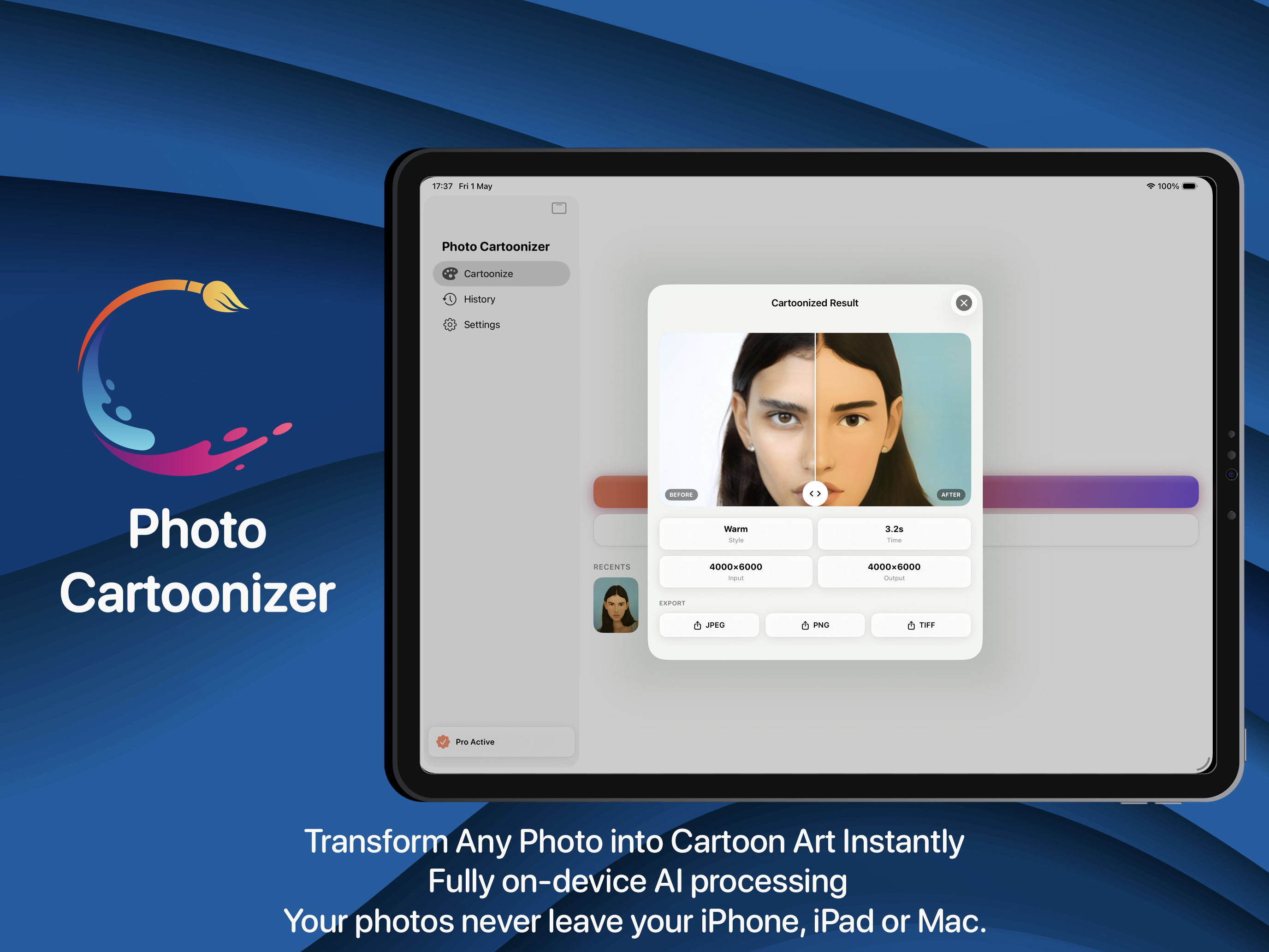
Photo Cartoonizer runs the conversion on-device across iPhone, iPad and Mac, with the presets and strength control in one place so comparing three versions takes about a minute.