Your birth chart is fixed by one instant and one location. Change the location and the planets stay exactly where they are against the zodiac, but the horizon and the meridian move - so the angles change, and with them the houses.
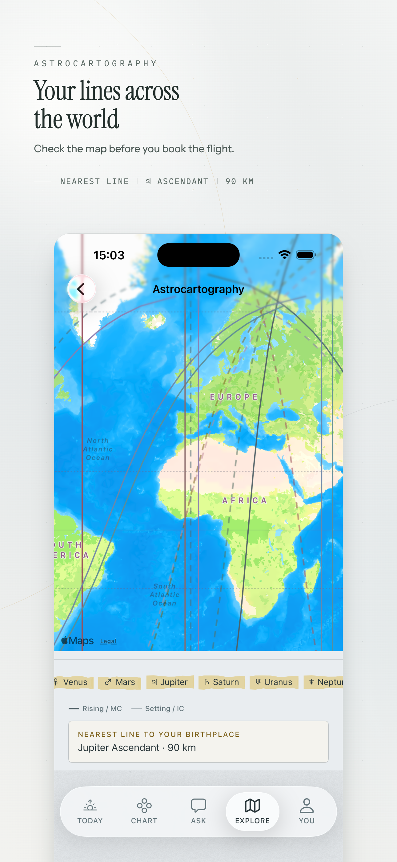
Astrocartography takes that to its conclusion. For every planet, it asks: across the whole surface of the Earth, where would this planet have been exactly on the Ascendant at that moment? On the Midheaven? Those loci, drawn on a map, are the lines.
Four lines per planet
- AC - the planet was on the eastern horizon, rising.
- DC - on the western horizon, setting.
- MC - at the highest point, culminating.
- IC - at the lowest point, beneath the observer.
MC and IC lines run roughly north-south, because the meridian is a line of longitude. AC and DC lines curve, sometimes dramatically at high latitudes, because the horizon's relationship to the ecliptic depends on where you are.
Ten or so bodies, four angles each, gives about forty lines. A map showing all of them at once is unreadable, which is why the useful move is to display two or three planets you actually have a question about.
What the interpretation claims
The traditional reading is that on or near one of your planetary lines, that planet's themes are more present in how life goes there - a Venus line for relationships and pleasure, a Saturn line for structure and difficulty, a Jupiter line for expansion.
It is worth being clear that this is interpretation, not calculation. The lines themselves are a geometric fact with one right answer. What living near one does is a claim, and not one the arithmetic supports or refutes.
The version of this that survives scrutiny best is the reflective one: a line is a prompt to think about what a place is for. Somebody weighing a move already has reasons, and a Saturn MC line is a reasonable occasion to ask whether the plan is genuinely about work and whether they have accounted for how hard it will be.
How close is close?
Practitioners commonly use a few hundred kilometres either side, sometimes describing the influence as fading with distance. There is no derivation behind those figures. Treat a line as a broad region rather than a precise border, and be suspicious of any reading that depends on which side of a street you live.
Where it is genuinely useful
Two situations, both narrow.
Choosing between shortlisted options. If two cities are otherwise equal on the things that actually decide a move - work, money, people, language - the map is a reasonable tiebreaker, in the sense that it makes you articulate what you want the place to do.
Looking backwards. Check the places you have already lived. That is the one test of the technique that uses evidence you did not select, and it is more interesting than any prediction, in whichever direction it comes out.
Where it is not
Not as a substitute for the ordinary reasons people move. A Jupiter line does not supply a visa, a job or a language. Choosing a country primarily because of a line means letting a diagram outrank things that can be verified.
And a related point: a relocated chart is not a new birth chart. You were born once. Relocation asks what the same moment looks like from a different vantage point, which is a genuinely interesting question and a different one from being born there.
Reading a map without over-reading it
Show two or three planets, not forty. Start with the places you already know. Notice which lines pass near somewhere you loved and somewhere you did not, and hold both results with the same weight - which is the part people find hardest, and the only way the exercise tells you anything.